At the end of every year, as my girls run around the Christmas tree in excitement for Santa, I am giddy at my computer awaiting the release of the Pantone Color of the Year. This year – drum roll please – it is ultra violet, aka a very deep purple that looks almost regal. Honestly, I think it’s perfect for 2018! Beyond the tie to the royal wedding on the horizon, I see 2018 as a year to mix things up and try something new. What better way to do that than with experimenting with such a beautiful and bold color?!
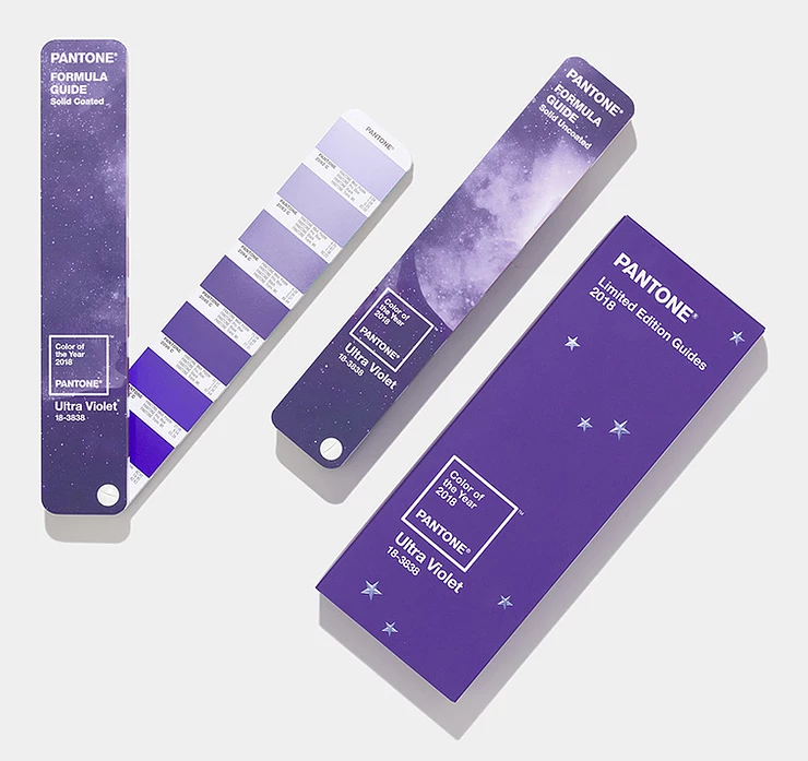
*Photo courtesy of Pantone
In 2017, the Pantone Color of the Year was greenery. Now y’all know how big of a fan I am of greenery, so needless to say I was 100% on board with incorporating it in every room possible in 2017. This year, with ultra violet, I’m excited to be more strategic about the placement in rooms to come. Not saying it has to be in every design, but I certainly think it’s something to play with for 2018.
As you look to incorporate the Pantone Color of the Year, take a peak at a few of my tips below to see how best to use ultra violet in your home:
1. Use it sparingly – think small doses like vases and lamps
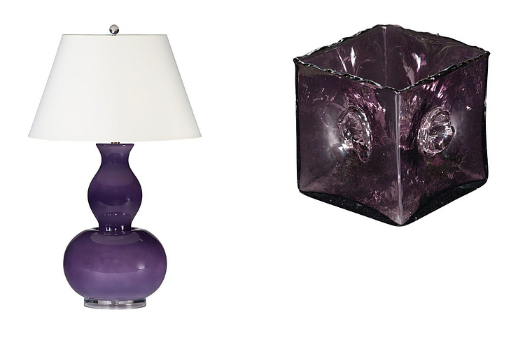
*Credit to Bradburn Home for the product imagery.
2. Pair with silver and gold accents
3. Look for art that has ultra violet tones to hang as a focal point in your room(s)
4. Florals are a great way to highlight the Pantone Color of the Year – purple orchids are a wonderful option
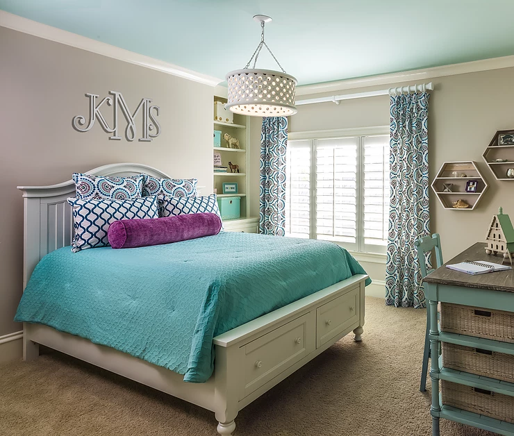
5. For kids, look for patterned bedding and pillows with notes of violet to incorporate into their spaces
Happy designing with the Pantone Color of the Year 2018!